extreme metal
lettering zine
I love digging into obscure letterform history, so teaming up with Space Type to write and design a zine on extreme metal lettering was a dream (dark fantasy?) come true. Together we took it from initial brainstorming to in-depth research on the topic to the finished product—a riso printed zine that’s just as badass as the subject matter.
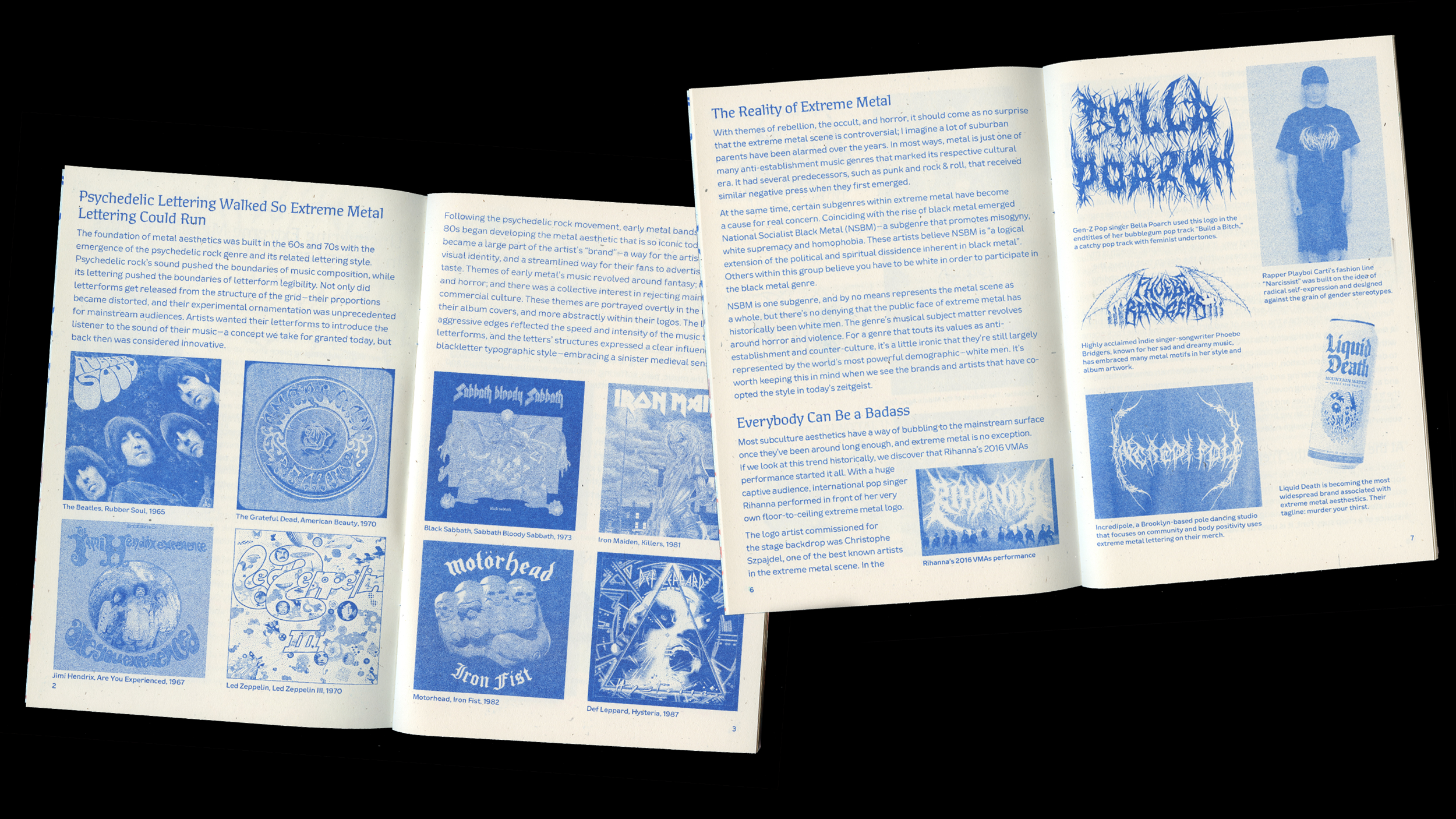
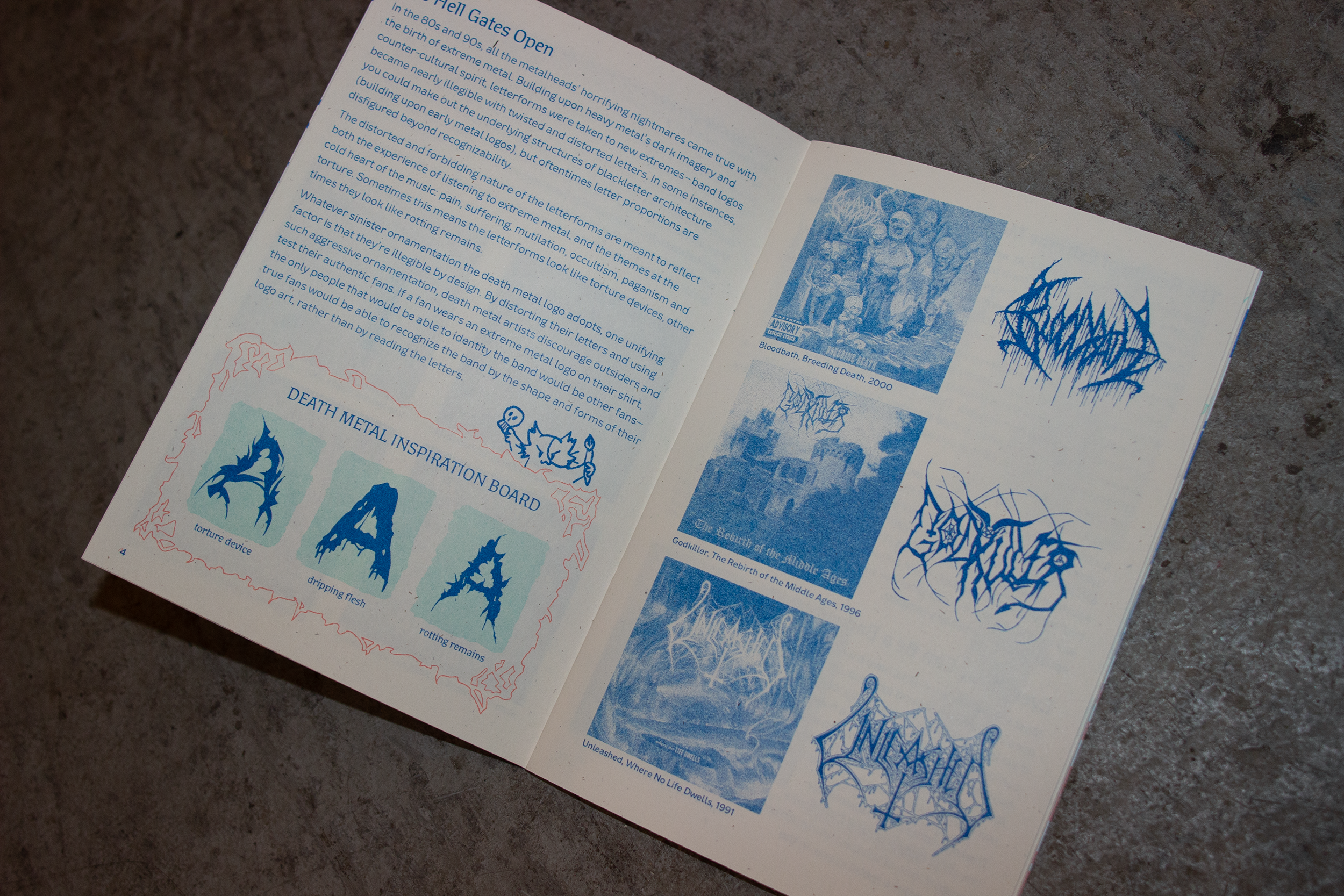
The first part of the publication showcases the origins and evolutions of extreme metal lettering aesthetics, while also discussing its relevance in mainstream culture. The latter half is dedicated to workbook pages that can help the reader build their own dark, forbidding letterforms.
Grounded in a belief that design education should be both accessible and approachable, and perhaps sprinkled with a touch of humor, I struck a delicate balance with the cover design. The gnarled and mutilated letters, emblematic of extreme metal aesthetics, found their counterpart in the vibrant palette of cheerful pastel hues. I had a similar goal with the essay I contributed, I intended for it to be just as readable to the casual enthusiast as the serious typographer.
My role: Cover art, editorial design, writer
Creative Direction: Lynne Yun
Lettering Exercises: Cris R Hernández